monogram
June 20, 2013 § Leave a comment

lettering vs calligraphy
June 7, 2013 § Leave a comment
Which do you prefer – lettering or calligraphy? Both are hot in the stationery world right now, and a lot of people do not even know there is a difference. Two very awesome artists in Berlin know there is a distinct difference, and they are currently battling it out!
![]()
here are a few of my favorite recent battles:
‘spring x’


‘fluorescent w’
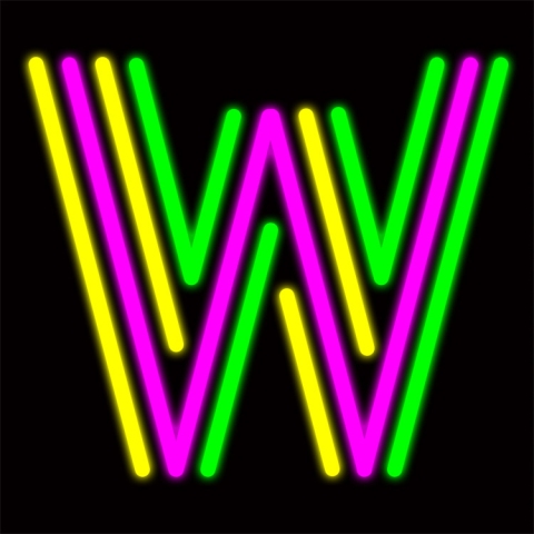

‘dreamy t’


interested in some awesome lettering or calligraphy classes (and happen to be in Berlin)? sign up for some hand-made goodness on their site!

good logo, univega
June 3, 2013 § Leave a comment

brand me
May 2, 2013 § 2 Comments
i hate being the sporadic blogger, but alas, it does happen! i like to make up excuses for myself though — branding folding bones press is one of them. my dear friend charles (you might remember his illustrations within my Bozart Collective collaboration!) is busy designing, painting, and photoshopping away my very own logo!

these are the very first rough mock ups. what do you think? what are you drawn to and what don’t you like?
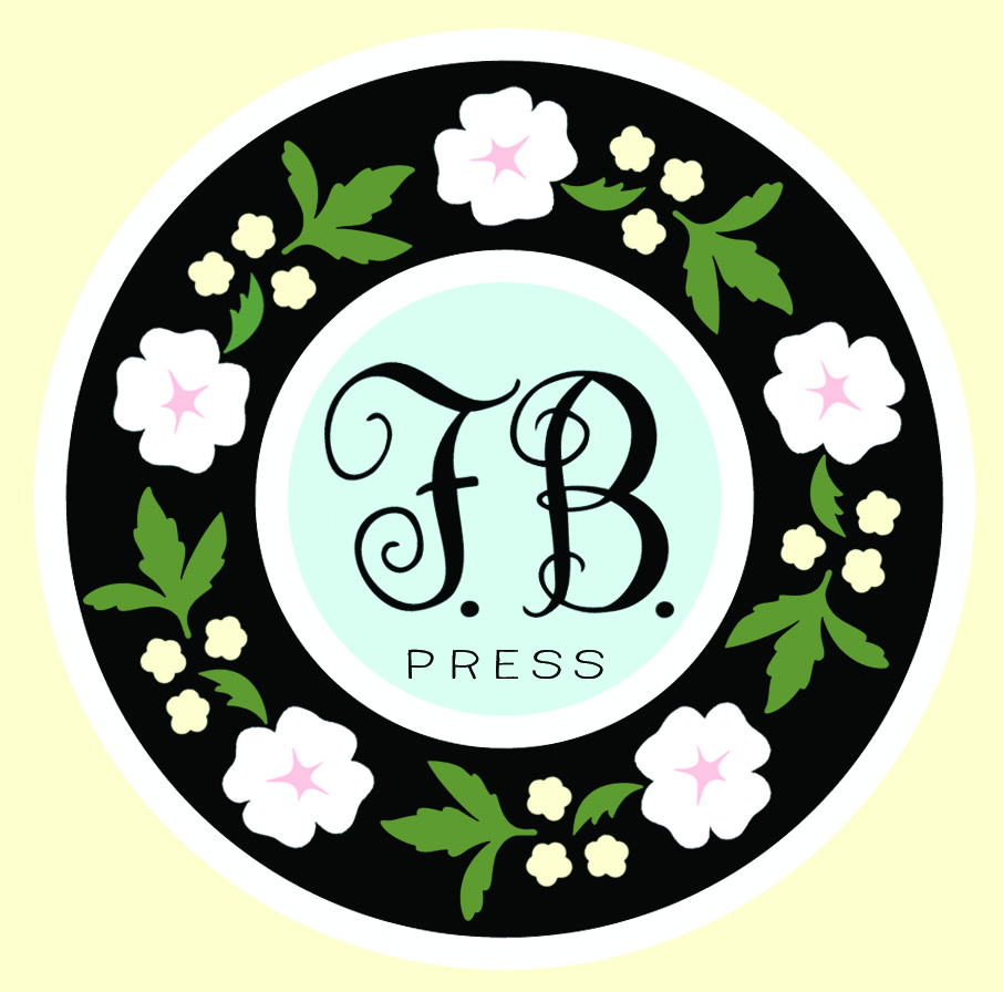
originally i wanted to stay clear of too much graphic, but a flower pattern might really win me over in the end. hand lettering or calligraphy will definitely play a role.

i am going to try my hardest to keep updating every week. i will definitely keep you updated as folding bones evolves into a real, live brand!


